by Marzena Żurawicka
In the past, consumers could identify the gender of a brand without major difficulties. It was enough to ensure that the brand’s communications use the sign of a man or a woman, or objects that explicitly represent the world of males or females. For example, in Polish culture the object-sign of masculinity was a disposable razor and the object-sign of femininity – perfumes. The term “perfumes” was not used to describe a man’s fragrance at all, the term “eau de toilette” was used instead. These two signs were clear for consumers and their use in communications sufficed to identify either of the two worlds.
Nowadays, given the development of unisex products and services, which target both men and women, ensuring unambiguity in the identification of brand gender is becoming more and more difficult. The earlier-quoted objects – a disposable razor and perfumes – have lost their previous status. Today, their gender is decided by designers, people creating individual products, packaging, and communications.
Significant changes have also occurred in the area of consumer behaviours. Consumers feel more and more confident juggling signs and symbols emphasising their cultural, and not necessarily, biological gender. Looking at Warsaw’s streets from the sidewalk level, deciding explicitly whether the person is a woman or a man is becoming increasingly difficult. The footwear of most pedestrians is not a simple exemplification of their owners’ gender, nor does it send a clear message. The footwear of Warsaw’s pedestrians often has mixed characteristics – feminine and masculine or neither feminine nor masculine. Yet, there are also pedestrians, whose gender can be identified without too much doubt – they are those, who wear stilettos or moccasins.
These small examples from our everyday life illustrate the scale of the problem and show the need for more conscious management of masculine and feminine attributes. Therefore, answering the question – what gender should be given to the brand so that it achieves our business goals? – is one of the requirements of contemporary marketing.
Footwear, a sidewalk, and the Greimas semiotic square
Before we immerse ourselves in the world of marketing cases, let’s focus for a moment on the earlier raised topic of Warsaw’s sidewalk, footwear, and the Greimas semiotic square.
In Polish culture, stilettos are a sign of femininity, while moccasins symbolise masculinity. But in line with the logic of the semiotic square, the term “gender” means more than just masculinity and femininity. These two categories do not fully reflect the full scope of the term. According to Greimas, masculinity and femininity are completed by non-masculinity and non-femininity. In Polish culture these ideas correspond to an effeminate male and “a butch female”. Whereas we can quite easily quote attributes of masculinity – moccasins or femininity – stilettos, we cannot say much about attributes of the footwear, which would best identify an effeminate male or a butch female. The answer is in the semi-symbolic system of non-masculinity and non-femininity, which is composed of cultural situations, colours, language, music, and other sounds.
Nonetheless, even a superficial analysis of the vast cultural material suggests caution in addressing the topic. While each of the four categories has rich symbolic representation, each is in the state of permanent change. Hence, attributing either gender with its own system of signs, requires stopping the passage of time, even if for just a short moment, and selecting examples that are their best most evident exemplification.
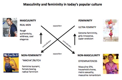 In the above-named semiotic square, “masculine” gender is represented by signs of authenticity, harshness, fierceness, knight’s nostalgia or cold elegance, as well as black, graphite or grey colours.
“Feminine” gender is co-composed of signs, motifs, and symbols of a woman’s erotica, sexuality, allurement, but also signs of a girl’s innocence or a woman’s duality, as well as lucent colours.
Non-masculinity is the gender category, which reflects the idea of effeminacy, ie. masculinity with additional feminine elements. This gender is represented by signs and symbols of metrosexuality and masculine romanticism. Parts of non-masculinity are images of a man’s body shown in a feminine manner and situations, in which men perform women’s roles.
In the semiotic square, non-femininity means femininity with additional masculine elements. In Polish culture, it is represented by signs of women’s aggression, extreme feminism, and images of a woman endowed with masculine attributes, e.g. an athletic body, logical reasoning, calmness, and self-composure.
Problems with identifying brand gender
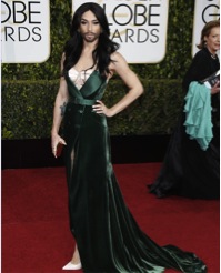
Male-female relations have never been the simplest topic in culture. They have often been the reason for wars, social revolutions or even economic disasters. However, until not long ago we were sure that signs like long hair, a long dress, a graceful body, a velvety voice identify femininity. Nowadays, we do not have such certainty anymore – Conchita Wurst, the winner of last year’s Eurovision, is a good example.
 Similar suspicions relating to gender, yet this time the gender of a brand, were shared by one Polish telecom company. In 2012, the company turned to us for help in identifying the identity of their own brand. Based on the results of the consumer studies, the company suspected that the gender of their brand changed. The study showed that the brand was less and less popular with men, while its popularity with women was increasing. Despite the significant similarity of the product offer of the company’s brand and the brands of its competitors, the company was increasingly afraid of losing male customers. The brand’s new advertising communication and visual identity system were blamed for the situation. This hypothesis formulated by the client seemed probable.
Five major telecom brands operated on the Polish market at that time: Orange, Plus, Play, Era (T-Mobile) and Heyah. In the rebranding process, one of them gave up the use of its logo and blue/ navy-blue colours in favour of intense pink. The change in the brand’s logo colouring had a cultural significance. Everyone in Poland knew that a blue colour was the sign of a male descendant and pink – the sign of a girl. Although, new associations with pink enriched culture over time, this was yet to show in social practice in 2012. Logotypes of masculine brands were dominated by colours like blue, black, grey, and white. The first Polish masculine brand, which inaugurated the use of pink in a logotype, was the Polish branch of Tauron, a producer of electrical energy.
The use of a pink colour in the brand’s communication was not an ordinary marketing decision in those years. However, neither we nor, even more, the client considered the change in the logo colouring to be the exclusive factor responsible for the brand’s gender. We were convinced that the development of the brand’s gender was a complex process, which was down to a whole system of signs, symbols, and codes, including those used in advertising.
Cultural glossary of feminine gender
In order to identify the brand’s gender we proposed an analysis, which consisted of identifying the sign system existing in advertising messages. To do this, first we had to determine the process of gender conferring in today’s culture and the signs making up each of the four gender categories. We needed cultural measures.
The sources of analysed materials included strictly masculine and feminine magazines, film posters, movies, and advertisements for selected product categories with a clearly defined gender, eg. perfumes, cosmetics, and clothes. Collecting the most distinctive material was crucial.
During the analytical process, after a preliminary study of the material we decided that our glossary would consist of the following units:
- Cultural situations, to which reference was made in the advertisements
- The palette of colours used in messages
- The mood of photographs, frames, editing, and pace of narration
- Language and text forms
- Sounds, music, and the voice of the lector
These parameters were distinctive and enabled us to describe the communications of each of the gender categories.
Below we present selected elements of our glossary in the case of femininity.
Strictly feminine situations in culture were represented by girls’ meetings, women’s moments, and idealised romantic relationships. The palette of colours creating feminine gender was led by sensual violet, underlining textures, round shapes, but also pastel colours, symbolising a woman’s naivety and childishness. Feminine colours included brown-golden glamour, emphasising elegance and style as well as ultra-feminine pink, most often combined with traditional symbols of femininity, ie. flowers and ribbons.
 Mood of photographs, building femininity in culture, was created by the use of radiance, sunshine brightness, softened outlines of objects and people, whitening effect, as well as lightness and airiness. The photographs were dominated by flowing fabrics and hair, floating light objects. A feminine mood was added to the photographs by showing close-ups of fine features, which underlined sensuality, the feeling of the moment, as well as intimacy.
 Apart from visual elements, feminine gender was also decided by language. Notions dominating feminine culture included: changeability, seasonality, fashionable character or stylishness as well as elements relating to magic. The feminine nature of the language was strengthened by the use of intimate words, referring to care or exceptional moments.
The above-described elements of the cultural glossary did not exhaust the wealth of forms and conventions belonging to the feminine world. However, for the purpose of that study we identified the sign systems, which were most characteristic for feminine culture, thus helpful in further analyses of mobile telecom advertisements.
The cultural glossaries of, respectively, masculine, non-masculine, and non-feminine attributes were created following the same approach.
Gender in mobile telco advertising has many names
With the glossary-measures in hand we could finally start the main analysis, which included ca. 200 advertisements of the five mobile telecom brands operating in Poland.
All the telecom brands targeted their offers and communications at both men and women. That’s why it was important to determine, which sign systems are used by each brand and how its gender is created. Various approaches to brand gender could also be identified.
For example, in its identification and advertising communications system from 2011-2012 Plus used symbols and signs, which shaped its strongly masculine gender. Over a few years, the brand’s communication was dominated by masculine colours ie. graphite, cold black, and laser lights. None of the competitor brands used this repertoire of colours in such a consistent manner. Moreover, the brand’s masculinity was built by the language used in its advertisements – full of terms from the area of technology, technical precision or the world of thrills belonging to action movies. The brand’s masculine gender was also co-created by military metaphors, and even sexist wit. The brand used quite a wide range of masculine culture signs.

A totally different example of brand gender building was used by T-Mobile. About 80% of the brand’s advertisements from 2011-2012 were dominated by feminine culture symbols. The brand’s identification were light soap bubbles, floating in the urban space or flowing woman’s hair. While the feminine character of the photographs was achieved by using techniques such as radiance and blurred outlines of people, its femininity was completed by the widely used colours ie. pink and flesh-coloured beige. The advertising agency based the brand’s communication on the situations characteristic for feminine culture ie. women’s meetings, romantic relationships, and tender images of childhood. The brand’s slogan referred to feelings.

An example of the mix of the two approaches came from Orange. One half of the brand’s communications used signs of true masculinity – colours like black or graphite. The language was filled with quite many references to technological precision, mastery, sensational dynamics, and logic or rationalism. In its masculine advertisements, the brand used many phrases taken directly from the language of masculine entertainment. The other half of Orange communications was built on feminine symbols. The feminine mood of photographs showed in their radiance and the predominant brown-golden colour. The brand’s communication was based on romantic situations, idealised relationships or women’s moments. The language used in the brand’s communications used terms from the area of magic and emotional care.

Conclusions
It is evident that the way feminine, masculine, non-feminine, and non-masculine attributes are used in brand communications is quite often mixed and a well-thought out symbolic strategy is rare. As indicated in our analysis, the quantitative proportions between masculine- and feminine-type advertisements used by individual brands may also impact the perception of brand gender.
The Orange brand strategy is safest for mobile telecom brands, whose customers are both men and women. The brand has created two parallel semi-symbolic systems responsible for feminine and masculine gender. It has given consumers the possibility of picking messages suitable for them and freedom in choosing their approach to feminine and masculine gender signs.
Orange has allowed consumers to sometimes wear stilettos and sometimes moccasins. But what conclusions were drawn by the brand which turned to us for help? In its new communications, the brand clearly discontinued the use of the distinctively feminine system of symbols. New advertisements were developed using a masculine system of signs. The brand’s communication was balanced with masculine colours ie. silver and grey, and by metallic elements.
The semiotic gender analysis showed that masculinity and femininity are not exclusively built on images of men and women, but also on wide-ranging sign systems, which can be deliberately managed. Having no control over these systems has serious complications for the brand’s life, especially in the case of brands targeting both genders. The results of the study brought inspiring recommendations for strategy and creation experts in advertising agencies, as well as guidelines for brand managers as to how better to manage the brand’s gender, which masculinity and femininity signs to use in the brand’s communications and in which proportions in order to, for example, create a sub-brand with feminine attributes within the masculine brand.
Marzena Żurawicka is a Partner at Semiotic Solutions, Poland.


2 comments
Thanks so much for sharing this. I just came across your article and really love it!
Thanks a lot for great information about brand name selection and coloring.